How to build a bump chart
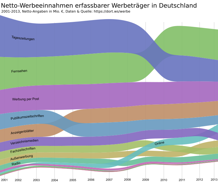
Sometimes you see all the data but only with the right visualization you’ll grasp what really changed. For example when looking at a table with absolute numbers of advertising revenue distributed to different types of media in Germany in the last twelve years I saw: The market shrunk and daily newspapers obviously lost advertising between 2001 and 2013. But what else?
After visualizing this data as a bump chart I could see at a glance when what happened: We see different shifts in this twelve year. First free newspapers overtook paid magazines (2005), then display ads on the web overtook radio (2008) and then TV overtook daily newspapers (2010). A bump chart can be useful for analyzing this kind of data.
But how to build one? Here is a How-to:
1. Prepare the data
I used data from a table I prepared for Wikipedia. It is easy to grab this kind of numbers directly from Wikipedia, mark the table (without the headline) and paste it into a spreadsheet like the free (as in speech and beer) Libreoffice Calc (here is the odc-file).

Then save it as a csv-file (comma separated values). That is a format tools like the one we will be using next interpret. Open the saved file with a text editor (like Notepad++ or Textwrangler).

See all the commas? Great, they separate the values in a way Datawrangler understands. Copy the data.
And paste it here at Datawrangler. This is a tool which can transform a spreadsheet a human can easily read into a spreadsheet that visualization tools like the one we will use can interpret. The difference: We like many figures in a row (if the reading direction follows time), software tools often like a normalized format better: one figure, one year, one data type per row.

With Datawrangler this is done in seconds.
Select the first row (containing years) and click on promote in the menu above, than on promote row #1 to header on the left.

Next step is the real reshaping of the data. First select all columns containing figures by clicking on every year in the first row with the apple or shift key pressed. When all columns are selected you choose fold from the menu above and than the option fold 2001, 2002 (and so on in my example) using header as a key.

It should look like this:

You export the data with a quite small export button on the left.

3. Visualize the data
Now let’s head over to RAW – the missing link between spreadsheets and vector graphics a team at the DensityDesign Lab of Politecnico di Milano developed. Paste the data here.
Select Bum Chart as your preferred output.
Scroll down and map the dimensions. That means: You tell which of the three numbers in every row is what (Date, Group, Figure).

And now you’re done! You can customize width, hight and colors and so on and copy the embed code into your blog or wherever you want to publish the bump chart.
4. Customize and enjoy
Some details in the embed code can only be changed with a good text editor. For example: In my example RAW added a comma to every year. I don’t need that, so I fixed that with an editor. I searched for 2,011 and exchanged that with 2011. You can change stroke-width, font-size and the font-family used for your categories too.

You can work on the downloaded SVG with a vector based graphics editor like Inkscape and export the file in all sorts of formats. The PNG-File above is an export from Inkscape. Below you see an embedded version.
- Auf Twitter teilen
- Auf Facebook teilen
- Auf LinkedIn teilen
- Auf Pinterest teilen
- Per E-Mail teilen
- Link kopieren


